Foodaverse: Visualizing food in VR
November ’21 || Unreal, C++, Python, UI/UX Design, Programming
A VR data viz to explore connections between flavor and food!
I programmed and designed a VR Data Visualization which used a dense data set that was manipulatable in real time. As a programmer, I made sure data manipulation and rendering were performant. As a designer, I created an interaction system that let users intuitively play with data without using any controller buttons.
Visualizing Data in VR
In VR, everything is 3D! While this is nice for games, it can be a mixed bag for data visualization
Visualizations that are 3D emphasize certain aspects of data, but also cause them to become more confusing to read especially when data gets dense.
Our app’s design pillars were built around Schneiderman’s Mantra:
· Overview: the user is immersed inside the data.
· Zoom: stretch the chart horizontally or vertically.
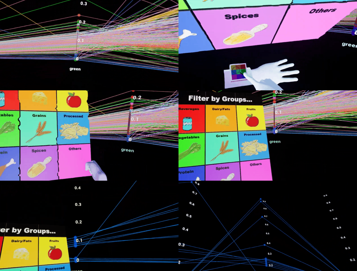
· Filter: Show specifics of food flavors by food type via wrist menu.
· Details on Demand: Per axis data averaging and individual point info.
About the Data set
We decided to use the FooDB database, which covers more than 790 food entries and over seventy thousand flavor components.
We used it to visualize 636 food ingredients and categorize them into nine food groups. Then, parsed each flavor compound into nine categories. Each category was given a color label to visualize the relationship between food and flavor profiles.
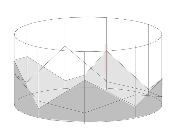
We created a parallel coordinate system because the user will still be viewing a 2D database which helps with readability by avoiding the strain of interpreting 3d data points.
How I rendered thousands of manipulatable points
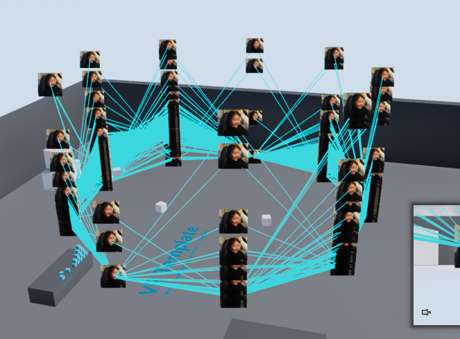
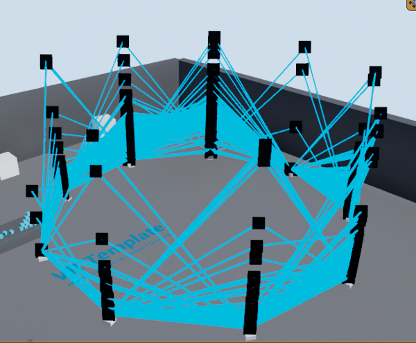
Rendering thousands of basic shapes like cubes would not be effective, so I tried using sprites instead. Sprites were more performant over meshes (an improvement of unplayable to 20 FPS), but problematic as their size was rendered relative to screen space.
Finally, I decided to render using Unreal’s Debug Points as they were the simplest for Unreal to render. Connecting points to each other was accomplished using Draw Debug Lines as using Niagara particles was not performant enough and would not scale well.
Interacting with the Data Set
Users can scale the axes vertically and horizontally by squeezing their hands into fists and moving them apart from each other. These controls help the user zoom to focus and improve the legibility of the data. After scaling the axis, the user can travel up or down to focus on any section they want.
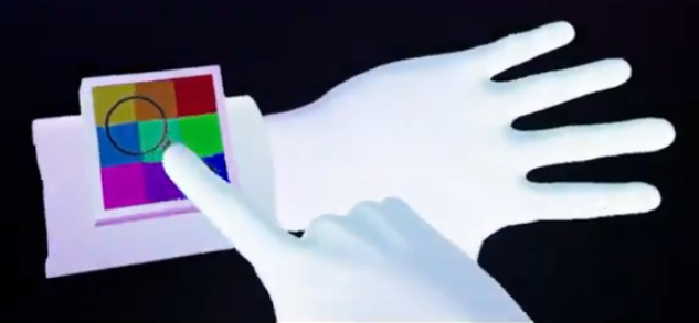
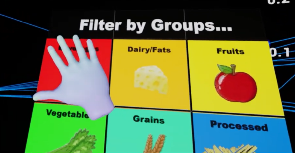
There’s also a filter tool that isolates specific food groups. They can access the filter tool by tapping on a wrist interface on their left hand which brings up a menu that sorts by specific food groups. To decrease visual clutter, users can show averages of food flavors on each axis.
Finally, users can go up to any given point on the chart and grab it to see more details on demand. Upon selection, a widget pops up with the image of the food description and other information taken off from the FooDB dataset.
Conclusions
Pick the right medium for your data set
VR’s strength for visualization is its ability to represent spatial data well. It’s much better to visualize inherently spatial data such as a player's movement in a sport or terrain information instead of numerical data.
That being said, our approach to visualization differs from contemporary VR data visualization research as they focus on smaller “tabletop graphics” whereas we invert this by fully immersing the user in the data.
Each technique has its own strength, but by giving the user the right tools our method may overcome the existing problems in VR visualizations.
